Why White Isnt Right
Daniel Wurm | 14 Feb 2022
So you're thinking about painting your house off-white? Stop right there. Its a really bad idea, and I'm going to explain why.
Now what I'm going to say might seem pretty radical, especially because most glossy home maker magazines and web-sites extol the 'virtues' of minimalism and whiteness. 'White will make your home seem brighter'; 'white makes a room appear larger'; 'use off-white to lighten your house'; etc, etc Popular interior design blogs are filled with page after page of bleached walls and sterile ceilings which supposedly will make your house feel like a home. Australia's suburbs are filled with row after row of houses painted unimaginative names like 'White on White', 'Natural White', or 'Lexicon', which looks and sounds as boring as a dictionary.
I couldn't think of anything worse than painting my home a whiter shade of pale. I've painted hundreds of homes off-white colours over the years, but you won't find a single drop of the light coloured stuff on my own house, which I'm about to start painting next month. Why do I dislike white so much, and why should you avoid it in your home?
White is Boring
Technically, white is not even a colour. Surfaces which are white are reflecting all the light wavelengths that hit them. It is one of the least common colours found in nature. The only animals who live in a white environment are penguins, the arctic fox, polar bears, and lately, humans.
White is described as cold, bland, and sterile. Rooms painted completely white can seem spacious, but empty and unfriendly. Hospitals and hospital workers use white to create a sense of sterility. Ignoring COVID, ask yourself, do you really want to live in a sterile environment? Do you think 'stark' and 'cold' are the words you want to use to describe your home?
One study on adults' color preferences showed that out of 18 total colors, including no preference, white only ranked fifteenth as the overall favorite color.# So why is white such a popular colour for interiors right now?
Its all comes down to marketing. People like to feel fashionable, even when the fashion of the day makes no sense. This psychological phenomenon led to the ridiculous hairstyles and pastel colours of the 1980s, and the brain-frying wallpaper patterns of the 1970s. Minimalism has been fashionable since the 2010s, but I'm tipping people have had enough of the blandness and downright starkness of bleached walls and empty, plain interiors. I'm calling it out for what it really is; dead boring, plain and unimaginative.
Do you really need a home to feel bright, stark and clean all the time?
If we are honest about it we often describe our favourite cafes and restaurants as 'cozy', 'welcoming', or 'relaxing'. This is often because their interiors are decorated with warm hues that make us feel relaxed and calm. Humans have been attracted to dark, warm tones since we started living in caves millions of years ago. Warm cozy spaces are more conducive to sleeping, eating, and love making, all activities we enjoy at home.
So why do we think the spaces in our homes need to be 'bright' and 'spacious', when what we really want to feel at home is 'cozy' and 'relaxed'?
White has also become popular because of the culture of renovating for profit. Instead of enjoying the creative experience and individual expression, TV shows have pushed the idea of cheap, fast 'flipping' of homes for sale, with no value given to the character of a space.
I can already hear the interior designers complaining; 'he doesn't realise that white walls allow us to highlight art and pieces of furniture in the room'. Well, I do understand that philosophy, and I reject it. Most of us don't live in a museum or art gallery; we live in homes that should be a individual as our own lives. And who needs works of art hanging on the walls, when the walls themselves can be works of art?
White Not Practical
I've often heard people say after painting an old house white, 'look how clean and fresh it looks'. Yes, painting the outside of your house will make it look clean; but not for long. Within only a few weeks or months spiders will set up homes, wind will blow dust, and rain will ensure it looks dirtier than before.
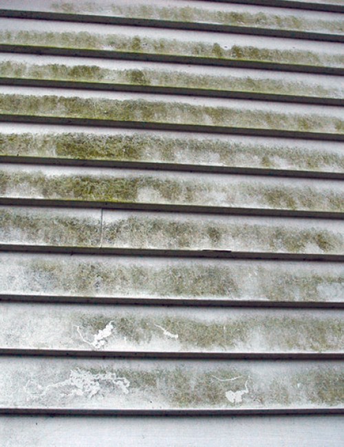
It's normal for houses to collect dirt and dust, but white makes it stand out. I've driven past many houses which were recently painted an off-white and its so disappointing to see them covered with dirt and looking worse than they did only a few months before. Mid tones and darker hues are ideal for hiding imperfections, and dirt. If you're worried about whether the dark colours will absorb heat, choose a heat-reflective paint like Astec Energy Star, which reflects heat even in darker hues.
Nothing breaks my heart more than when I see someone painting white over beautiful old timber trims, windows and doors. Sure, they look clean and new for a few months, until someone hits them with some furniture, or they get whacked by the vaccum cleaner. Then the paint chips off, and they are condemned to a never ending cycle of 'maintenance'.
If you have stained or clear finished timber windows, doors, skirting, walls or ceilings, learn to love them. Unpainted timber is not only natural, it requires little maintenance. If it gets hit by furniture you probably won't even notice. If you don't like the colour, why not stain it, or lime wash it? If the timber looks cheap, staining it up can bring a richness that you find in more expensive timber.
Where to Use White
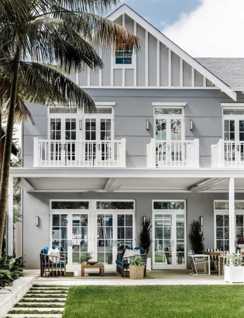
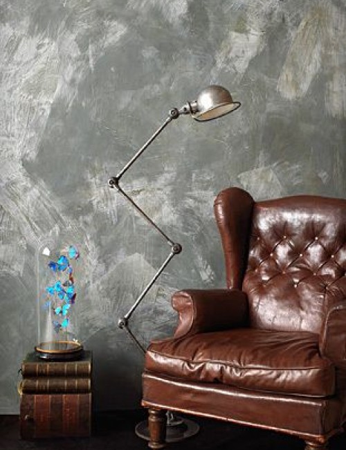
At best, white is an accent colour. Use it sparingly. When we look at nature we admire white in the clouds that 'pop' against a bright blue sky, the foam that crashes on the deep blues and greens of the ocean, splashes of flowers in a field of green, or the ice and snow crystals that drip from the trees or blanket the mountains. Similarly, our eyes enjoy white when it's used to contrast feature colours.
It looks great on trims, doors, windows and decorative features. And that's all.
Get Creative
The emphasis on white minimalism for interior design in the last 10 years has caused people to forget about the opportunity to enjoy the creative experience involved in creating a space to live and work. Instead of thinking about the resale value next time you decorate, think about how you want the space to feel.
For thousands of years people have decorated their homes with beautiful and decorative features. From the complicated feature laden homes of the Victorian and Edwardian eras, to the traditional timber finishes of Japanese architecture, to the brightly coloured buildings of India and South America, humans have used colours and textures to express their individuality, and their personality in their homes.
Above: Wallpaper designs are virtually unlimited and add character and 'pop' to a space.
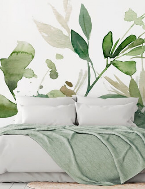
There are so many alternatives to plain white interiors, from the beautiful rich textures and patterns of wallpapers, to traditional french washes and lime finishes that bring colour and feeling to walls.
Above: Porters Zinc Finish
Want to improve your sex life? Paint your bedroom with darker colours, and get ready for more action! Want to sleep better at night? Surround yourself with calming colours and textures. Ask your family what colours and textures they like, and personalise the spaces they live in. If you have children who like drawing on walls, let them. Why not paint a mural on your walls, as a family? If you don't like the result you can always do it again next year.
Restoring a period style home? Resist the trend to 'modernise', and research the original colour schemes to restore it. Period buildings are not meant to be modern. Appreciate them for what they are; classic architecture and works of art. They are often filled with decorative features and trims that need to be emphasised, not just blended into the background. Flaunt their features; don't hide them.
Painting a heritage building white is like stripping the chrome off a classic car. It's a crime, and there ought to be a law against it.
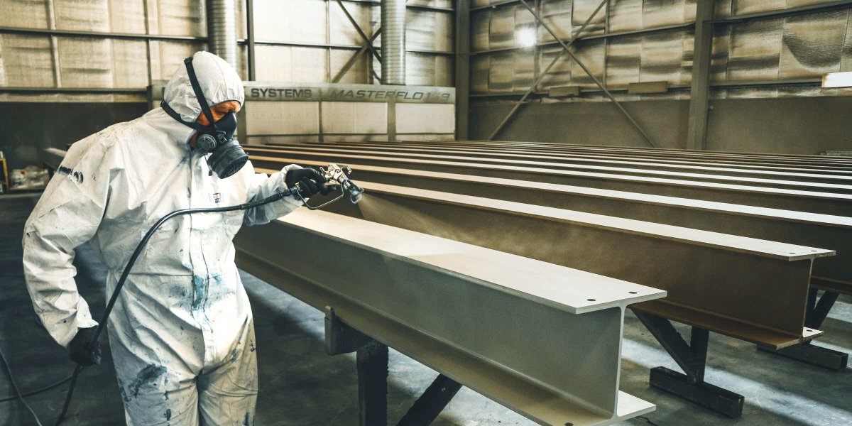
Did you know that professional painters can make anything look like marble? Its called imitation marbling, and every painter learns how to do it as part of their apprenticeship. Qualified painters can even paint things to look like timber, using an effect known as faux woodgraining. We can make plaster walls look like rusted steel, and your exterior walls look like they are in provincial France. We can restore your old house to like new, and help you find the colours that will bring your home to life.
If you really need to make a room brighter, install a skylight, or a bigger window, and let some natural light into the room. Painting it white isn't fooling anyone. White just isn't right.
Author: Daniel Wurm is a qualified painter and decorator with 28 years experience. He teaches decorative finishes and colour consulting at the National Painting and Decorating Institute.
Looking for a qualified painter to decorate your home? Find a trained painter on our directory.
#Bakker I, van der Voordt T, Vink P, de Boon J, Bazley C. Color preferences for different topics in connection to personal characteristics. Color Research and Application. February 2015;40(1):62–71