About Us
The National Institute of Painting and Decorating is the peak professional body for the painting industry in Australia and the Pacific. Read more about the Painters Institute here.
Find information and resources on licensing, WHS legislation, business development, paint inspections, products, nationally recognised training, and courses for painters and decorators. Join Australia's on-line forum for the painting industry.
Find qualified painters. Look for painters employment or find painters looking for work. Subscription is free for painters apprentices, employers and employees. Membership is open to manufacturers, RTOs, qualified trainers, consultants and painting industry.
Latest News
Tweets
Follow @Painters_Edu
 Painters Institute
@Painters_Edu
News
Our new Certificate III Surface Preparation and Coating traineeships and course is now available Australia-wide. Train your staff in industrial blasting and spray-painting
Painters Institute
@Painters_Edu
News
Our new Certificate III Surface Preparation and Coating traineeships and course is now available Australia-wide. Train your staff in industrial blasting and spray-painting
#abrasiveblasting #spraypainting https://t.co/8C4M8Acgkp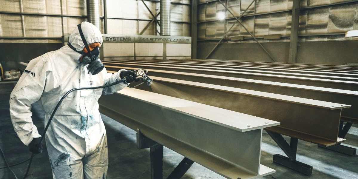 Proud to be launching on-site apprenticeship training in Western Australia, thanks to our partnership with Everthought College of Construction. Now, painting contractors located anywhere in Western Australia can train their apprentices on-site using our high quality lessons https://t.co/EC8CvNOXCs
  We are pleased to announce that we are partnering with Canberra Business and Technology College to bring onsite apprenticeship training to painters in the ACT. This partnership will improve the quality of training available in the ACT. #apprenticeships https://t.co/0q4T1yp2qS
 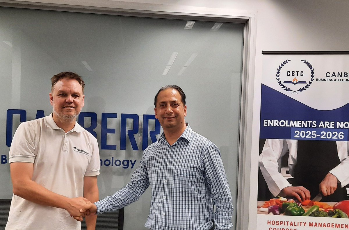 New video released on how to paint and back-roll plasterboard https://t.co/7QDgO9ssxv
Proud to launch a new course in Intumescent Coatings, in collaboration with @FireSecurityInternat. Training and nationally recognised qualifications for painters applying the ground-breaking new Fire Coat range of BAL-40 rated coatings.
New video released on how to paint and back-roll plasterboard https://t.co/7QDgO9ssxv
Proud to launch a new course in Intumescent Coatings, in collaboration with @FireSecurityInternat. Training and nationally recognised qualifications for painters applying the ground-breaking new Fire Coat range of BAL-40 rated coatings.
painters.edu.au/Training…/In… https://t.co/LqJhlwN1jJ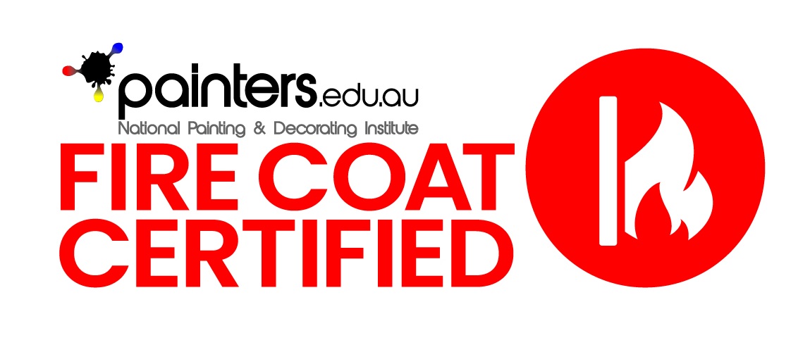 We are pleased to announce that the National Painting and Decorating Institute have finalised a formal agreement to work collaboratively with Wall andCeiling Institute. https://t.co/8bnvmg4Ajx
 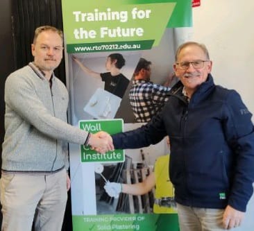 Forecast for Australian Painting Industry Growth over next 24 months painters.edu.au/Articles/Forec… via @Painters_Edu
These are the key paint trends for 2024, according to designers https://t.co/WsPSQstv8h
New BAL40 certified intumescent paint promises to revolutionise bushfire protection for Australian homes. #intumescent #FSAFirecoat
Forecast for Australian Painting Industry Growth over next 24 months painters.edu.au/Articles/Forec… via @Painters_Edu
These are the key paint trends for 2024, according to designers https://t.co/WsPSQstv8h
New BAL40 certified intumescent paint promises to revolutionise bushfire protection for Australian homes. #intumescent #FSAFirecoat
https://t.co/jNi1nSLabq Congratulations to all competitors and medalists at the @WorldSkills_AU Australia National Championships for Painting and Decorating.
Gold
Lachlan Matheson | Perth North WA
Silver
Antoinette Jackson | Perth South WA
Bronze
Ruby Bennett | Melbourne East VIC
#painting #apprentices https://t.co/oTwCPcDBJX
#abrasiveblasting #spraypainting https://t.co/8C4M8Acgkp
Proud to be launching on-site apprenticeship training in Western Australia, thanks to our partnership with Everthought College of Construction. Now, painting contractors located anywhere in Western Australia can train their apprentices on-site using our high quality lessons https://t.co/EC8CvNOXCs
We are pleased to announce that we are partnering with Canberra Business and Technology College to bring onsite apprenticeship training to painters in the ACT. This partnership will improve the quality of training available in the ACT. #apprenticeships https://t.co/0q4T1yp2qS
New video released on how to paint and back-roll plasterboard https://t.co/7QDgO9ssxv
Proud to launch a new course in Intumescent Coatings, in collaboration with @FireSecurityInternat. Training and nationally recognised qualifications for painters applying the ground-breaking new Fire Coat range of BAL-40 rated coatings. painters.edu.au/Training…/In… https://t.co/LqJhlwN1jJ
We are pleased to announce that the National Painting and Decorating Institute have finalised a formal agreement to work collaboratively with Wall andCeiling Institute. https://t.co/8bnvmg4Ajx
Forecast for Australian Painting Industry Growth over next 24 months painters.edu.au/Articles/Forec… via @Painters_Edu
These are the key paint trends for 2024, according to designers https://t.co/WsPSQstv8h
New BAL40 certified intumescent paint promises to revolutionise bushfire protection for Australian homes. #intumescent #FSAFirecoathttps://t.co/jNi1nSLabq Congratulations to all competitors and medalists at the @WorldSkills_AU Australia National Championships for Painting and Decorating.
Gold
Lachlan Matheson | Perth North WA
Silver
Antoinette Jackson | Perth South WA
Bronze
Ruby Bennett | Melbourne East VIC
#painting #apprentices https://t.co/oTwCPcDBJX
Newsletter
Sign up for painters e-news & receive the latest info
Contact the Painters Institute here.